Creativity
Responsive web design (RWD) is an approach to web design aimed at allowing desktop webpages to be viewed in response to the size of the screen or web browser one is viewing with.
The fluid grid concept calls for page element sizing to be in relative units like percentages, rather than absolute units like pixels or points
Flexible images are also sized in relative units, so as to prevent them from displaying outside their containing element. Media queries allow the page to use different CSS style rules based on characteristics of the device the site is being displayed on, most commonly the width of the browser.
Parallax Design
The term "parallax" first came from the visual effect of 2D side scrolling videogames that used different background image movement speeds to create the illusion of depth during gameplay. This was generally done by making the background of the game move slower than the foreground in order to make it seem further away.
This same concept applies to parallax site design in which the background of the website moves at a different speed as the rest of the page for an impressive visual effect that allows for countless creative applications for online storytelling.

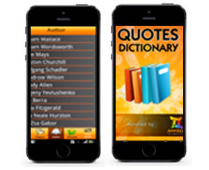
Mobile Website
As more and more people are turning to their smartphones first to get information about your business, it's important that you are delivering a satisfying user experience that is not only intuitively designed, but optimized for all mobile devices. In order to do that, you need the skills and expertise of an enterprise mobile developer, such as Unleashed Technologies, to ensure that your site performs well when it's accessed across multiple platforms and devices.